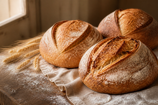
Image above
A stable stacked composition keeps the image before the copy at every container size.
Present products, services, people, places, proof, and atmosphere through one semantic media system. This page focuses on business-ready compositions; the separate technical appendix exposes the complete implementation matrix.
The same card primitive adapts to product photography, service explanations, team profiles, location features, and highlighted offers without inventing a new component for every business case.
A stable stacked composition keeps the image before the copy at every container size.

Contain fit preserves the complete product silhouette while responsive renditions keep the transparent PNG efficient in delivery.
The split composition becomes horizontal only when its own container has enough room.
Copy remains first in reading order while the image follows it visually and in the document.


The portrait profile selects a narrower responsive-image policy and a deliberate vertical crop.

Text sits over media only through a controlled dark surface and readable overlay recipe.
A featured card occupies the available grid recipe while keeping the same media and content slots.
Use these layouts for an about page, a service story, a venue introduction, a case study, or a campaign feature. Content keeps meaningful source order while the framework owns balanced spacing, edges, overlap, and responsive reflow.
The photograph is discoverable in initial HTML, the scrim resolves through a known dark surface, and the content remains readable without JavaScript.
Media and copy share a balanced two-column composition when the section container is wide enough, then return to a single readable flow.

The image reaches the section edges while the supporting story returns to the site measure and page gutters.
The storefront meets the viewport edge while the copy retains comfortable, design-owned padding.
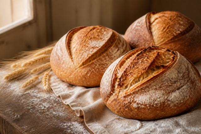
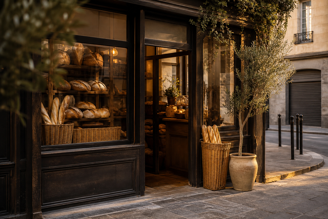
The content panel overlaps the photograph only at spacious container widths and returns to normal flow when room is limited.
An asymmetrical portrait and start-aligned caption create editorial rhythm without authored grid coordinates.
Motion can draw attention to an offer, location, or story image without becoming part of the reading contract. Reduced-motion and unsupported browsers keep the same complete static content.
A view timeline introduces the complete card. Layout and reading order never wait for animation.
The image enlarges inside its clipped frame only on devices that report accurate hover input.
Hover-aware zoom
Only the media layer travels a few percent through a CSS view timeline; the card content stays still.
A business may need ambient movement for mood or an informative video with controls and equivalent text. Both start from a useful poster and keep playback out of the initial rendering path.
The JPEG poster renders immediately. JavaScript attaches the silent MP4 only when motion is allowed, and a real button pauses movement that continues beyond five seconds.
Informative video does not autoplay. Native controls, explicit dimensions, localized timed descriptions, a poster, and equivalent text remain available.
Video unavailable. Use the visual transcript below.
From zero to four seconds, flat breads rest beside glowing embers in a wood-fired oven. From four to eight seconds, a baker's gloved hand turns a round loaf close to the heat.
Descriptive captions explain an image and should appear only when readers need that explanation. A provenance-only credit can instead sit in a logical image corner, with its creator and source still owned by the media catalog.

Galleries can present work, products, facilities, people, or before-and-after evidence. Every item remains present in source order while scroll snap and the native-dialog lightbox add optional convenience.
Swipe, drag, use a trackpad, or use the horizontal scrollbar through a row that remains scrollable at every width. The declared capacity controls how many figures are visible at once. Activate any image to open the accessible lightbox.
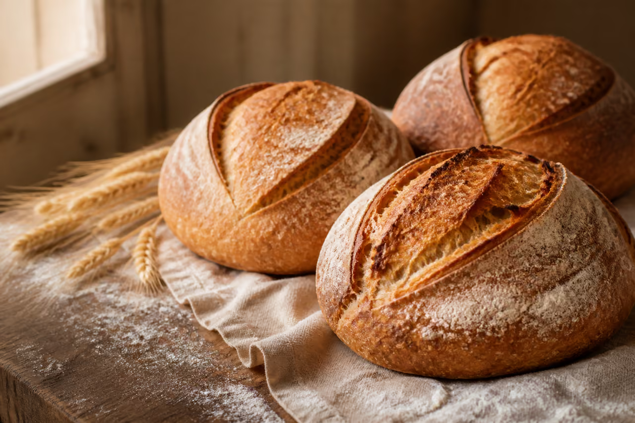
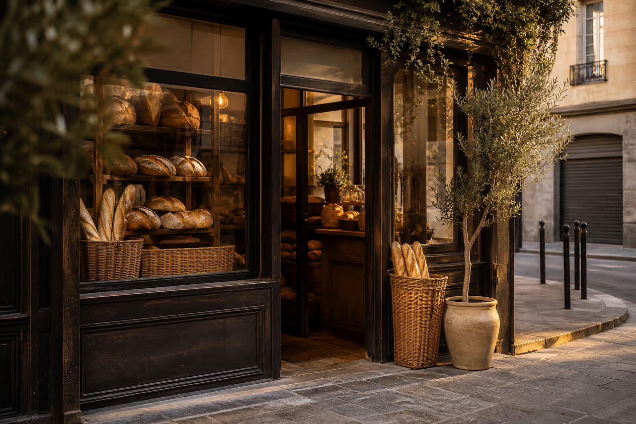










This gallery omits the lightbox entirely. All figures and captions remain available with no client-side behavior.


A wide lead photograph opens into varied portraits, details, people, and process images that keep meaningful source order without exposing grid coordinates.

Business imagery must remain useful on a slow phone as well as a large screen. The same system selects bounded sources, loading priority, and progressive enhancement alongside the visual outcome.
Named rendition profiles generate bounded source widths and accurate sizes hints instead of sending one oversized image everywhere.
Only the first showcase image is eager and high priority. Every later image is lazy-loaded and decoded asynchronously.
The gallery ships complete HTML first. One isolated script enhances direct links with a native dialog, keyboard controls, and focus return.
The technical appendix isolates every public media variant, resolved decision, fallback, and actionable invalid state from this business-oriented showcase.